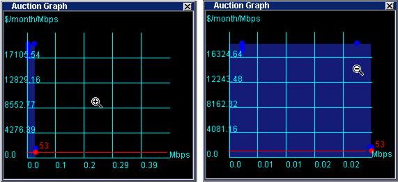
Auction
Graph
You can monitor auction behavior in real time on the Auction
graph.
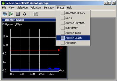
- To enable the Auction graph, select Auction Graph
from the Status pull-down menu.
For sellers the
Auction graph looks like the one shown.
The graph elements are:
- Auto-scaling Y-axis indicating unit price (axis is
scaled to show all current bids).
- Auto-scaling X-axis indicating quantity (axis is
scaled to show available quantity.
- Blue dots, representing the last bids received from
all bidders (excluding a bid by the Dynamic Seller agent, which is shown
as a red dot).
- A red dot, with ID number, indicating the last bid
from the Dynamic Seller agent.
- Red line representing your agent's valuation curve as
determined by settings in your active valuation window.
- A blue shaded area representing the allocation of
bandwidth to successful bidders. This area is a series of blocks, where
the height represents the unit price paid and the width represents the
quantity allocated.
Clicking the right mouse button changes the scale of the
unit price axis (Y axis). Note the units on the X axis in the examples shown in
the illustration. The cursor changes to indicate that the scale is expanded or
contracted.