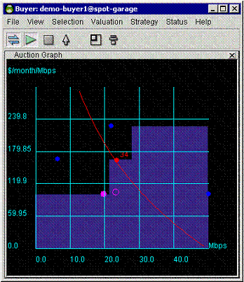
The Auction graph indicates the state of the Merkato auction in progress, not only for your agent but for all others actively bidding.
The graph elements are:
The black area above the blue shaded area represents the level at which you would have to place a bid to outbid a current bidder. Your active valuation curve is visible in relation to other bidders, whether you are bidding or not. This allows you to optimize your valuation curve with respect to the other bidders before you begin actively bidding.
While you are not bidding, the place at which the red curve intersects the top of the blue shaded area indicates the quantity and price of bandwidth you would receive if other bidders placed the bids you can currently observe. Of course, once you start bidding, other bidders will react to your bids and perhaps raise the market price (the blue shaded area) above what it was without you.
The two screens shown below illustrate this happening, as the bidders react to your presence in the marketplace. The best way of fending off other bidders and getting exactly the bandwidth you want is to have your curve nearly vertical at the quantity you desire. (Of course, this also means that you are willing to pay a higher unit price for bandwidth as well.)
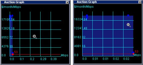
Clicking the right mouse button changes the scale of the unit price axis (Y axis). Note the units on the X axis in the examples. The cursor changes to indicate that the scale is expanded or contracted.