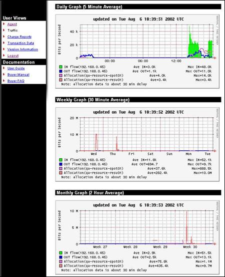
The Traffic screen shows the amount of data transferred through the Merkato network control point by the data stream associated with this user.
Three graphs are provided to represent three time scales:
All three graphs are based on five-minute sample intervals. Merkato gathers traffic statistics in both the input and output direction every five minutes. Each five-minute sample represents an average over that five-minute period. In other words, peaks lasting less than five minutes are not accurately represented in the graphs. These five-minute samples are used directly in the daily graph. These values are then combined into longer averages for the weekly and monthly graphs.
The green-shaded portion of the graph indicates traffic in the incoming direction.
Traffic indicated by the blue line is in the outgoing direction.
The purple and pink lines show data associated with specific resources.
The caption below each chart indicates the IP address of the network control point for which traffic is measured. For each flow, the caption lists the average traffic level and maximum measured traffic level for the traffic measured in the time window represented by the graph (daily, weekly, or monthly).
If you are unclear which direction corresponds to “in” and “out” with respect to your application, contact your Merkato administrator.
Use the traffic graphs to help you decide how much bandwidth to purchase on the Spot and reservations markets. Often, the best buying strategy is to buy what you normally use on the Reservation market, then purchase additional bandwidth during periods of burst demand on the Spot market. The traffic graphs can also help you select the maximum desired quantity for your Spot market valuation settings. There is little performance improvement, but potentially significant cost impact, when you purchase more bandwidth than you need.